Getting Started
- Welcome to FireBoard
- FireBoard Account & App Download
- Activate Your FireBoard
- Account & Activation FAQ
Bluetooth
- Bluetooth – Overview
- Bluetooth – Connection
- Bluetooth – FAQ
WiFi
- Wi-Fi – Overview
- Wi-Fi – FAQ
FireBoard App & Cloud
- Introduction
- Dashboard
- Sessions
- FireBoard Analyze™
- Alerts
- Advanced Settings
- Voice Control Devices
- FireBoard Cloud API
- FireBoard App & Cloud FAQ
FireBoard 2 Series
- FBX2 Series – Operations
- FBX2 Series – Screen Views
- FBX2 Series – Probes
- FBX2 Series – Device Specifications
- FBX2 Series – FAQ
- FBX2 Series – Firmware
FireBoard Spark
- Spark – Overview
- Spark – Settings
- Spark – Power Management
- Spark – Device Specifications
- Spark – FAQ
- Spark – Firmware
FireBoard Pellet Drive
- Pellet Drive Compatibility
FireBoard Pulse
- Pulse – Overview
- Pulse – Getting Started
- Pulse – Device Specifications
- Pulse – FAQ
- Pulse – Troubleshooting
FireBoard Beacon
- Beacon – Overview
- Beacon – Getting Started
- Beacon – Device Specifications
- Beacon – FAQ
FireBoard (FBX11)
- FBX11 – Operations
- FBX11 – Screen Views
- FBX11 – Probes
- FBX11 – Device Specifications
- FBX11 – FAQ
Drive Operations
- Drive – Overview
- Drive – Fan Installation
- Drive – Using a Fan
- Drive – Programs
- Drive – Settings
- Drive – Blower Specifications
- Drive – FAQ
Probes
- Probes – Overview
- Probes – Accuracy
- Probes – Calibration
- Probes – Care & Maintenance
- Probes – Specifications
- Probes – FAQ
Yoder ACS Controller
- Yoder – Overview
- Yoder – Firmware
- Yoder – FAQ
Troubleshooting
- Frequently Asked Questions
- Power Test
- Battery
- Diagnostics & Log Files
- Repairs & Warranty
- Factory Reset
- Water Damage
Beta
- FireBoard Beta Program
Dashboard
The Dashboard is the page you land on when you open the App. If you are not currently running a session, the most recent session date will be displayed at the top.
When the App is opened and a session is in progress (the FireBoard is on and a probe is connected), you have two view options: “Detail” and “Chart”.
Chart View
If you are in the Summary view (previously known as Detail view), tap “Chart” in the top right corner.
The Chart View will display current real-time temperatures across the top of the screen. The temperature data is also rendered into the chart at the bottom of the screen. Tapping a data series on the chart will display time and temperature information about the highlighted point. Double tapping or pinching the chart will zoom in to a smaller time resolution; drag the chart left or right to pan through the time series.
Tapping the three dots next to the session title allows you to:
- Take Photo: opens the camera on your device. Take a photo and add a note to the session.
- Add Note: add a note to the session. From here, you can also add a photo.
- Edit Session: edit session details, including title, start and end times, and description.
Tapping the session title bar will display a Session Detail page. Here you can view the session chart and swipe right to view Session Notes and photos. Tapping the Pencil icon will also allow you to edit the session. Learn more about sessions here.
If a fan is connected, tap “Drive” in the top right to change Drive views.
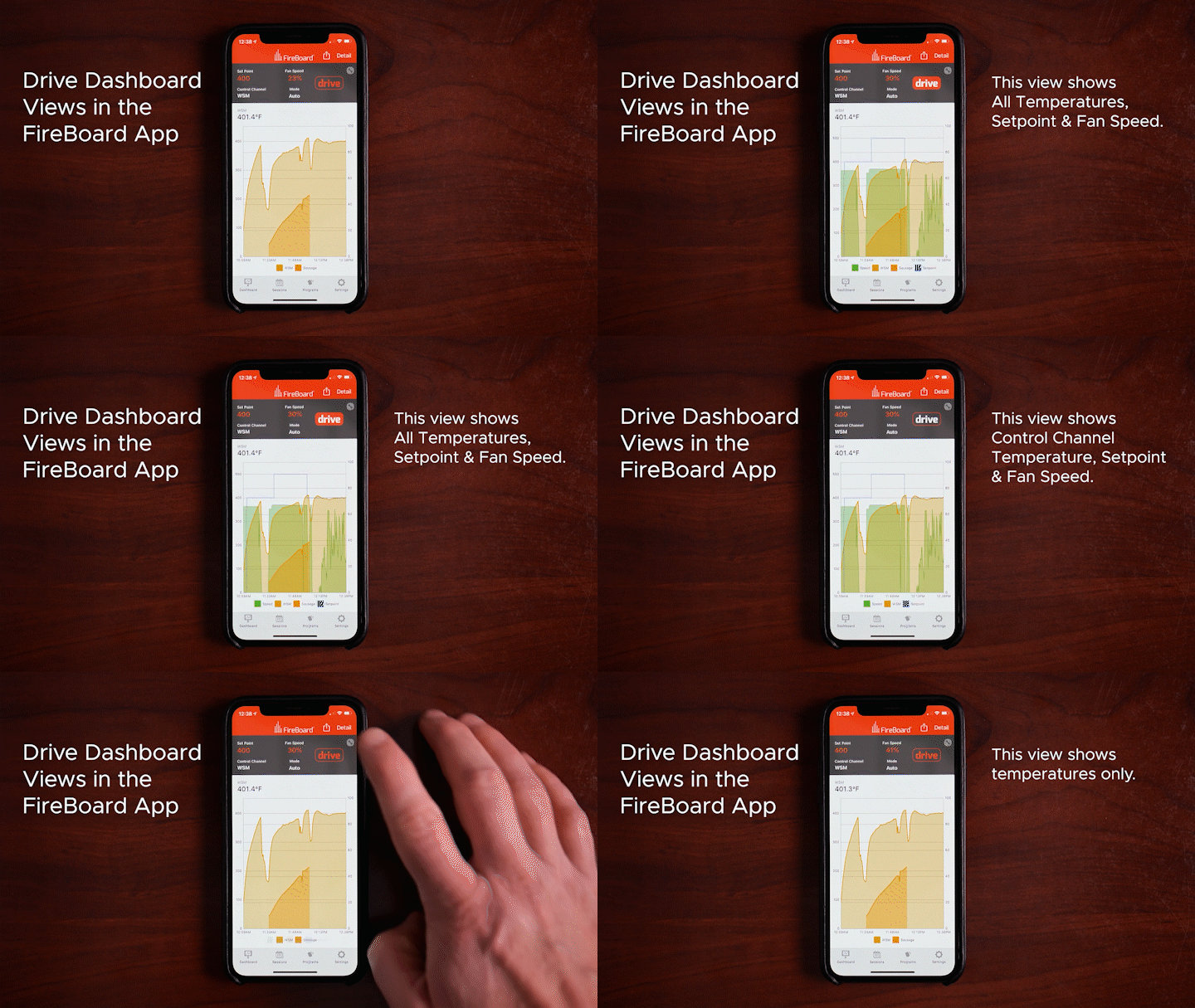
See the Drive section to learn more about Drive functions.
Summary View
If you are in Chart view, tap “Summary” in the top right corner.
The Summary view provides a more detailed view of your current temperature data. The channels are stacked vertically down the screen, displaying not only the current temperature but also the max/min values of alerts set, a last updated timestamp, and a sparkline chart displaying the channel’s temperature data.
Tapping the channel row will open the Channel Info screen where you can change your channel label, add alerts, and manage notifications.
Tapping the sparkline chart for the channel will open the Single Channel View screen, featuring a zoomable chart for the channel’s data as well as a date range tool to view historical temperature data. Up to two weeks of data can be displayed on a single channel chart. The Calendar icon in the top allows you to change the time range view while the Pencil takes to you to the Channel Info option.
Customizing Channels
In the Summary view, tapping on the left side of a channel row, near the temperature and channel name, allows you to customize the channel via the Channel Info screen.
- Open the FireBoard App.
- If you are in the Session view, tap any of the current temperature readings to open Channel Info.
- If you are in the Summary view, tap the temperatures on the left side of the row to open Channel Info.
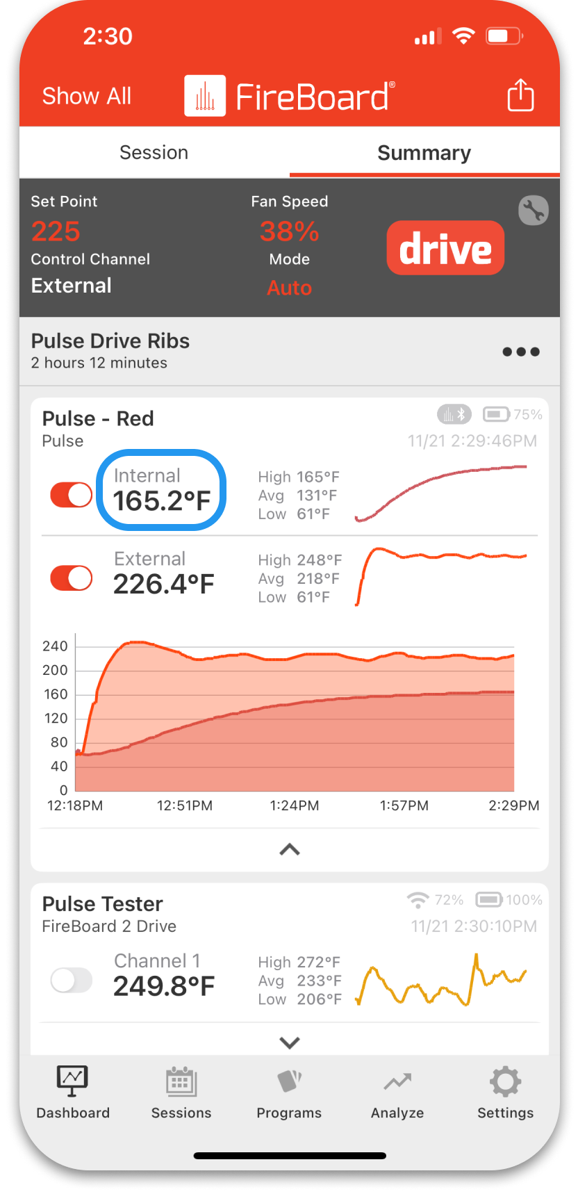
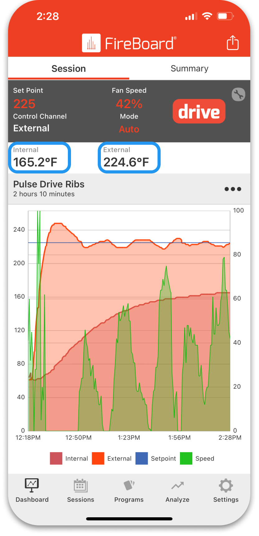
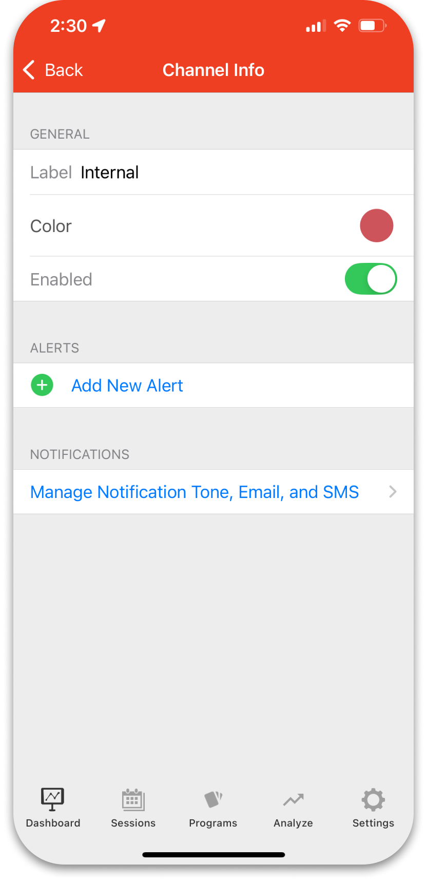
To change the channel name, tap the current channel name then enter the new channel name.
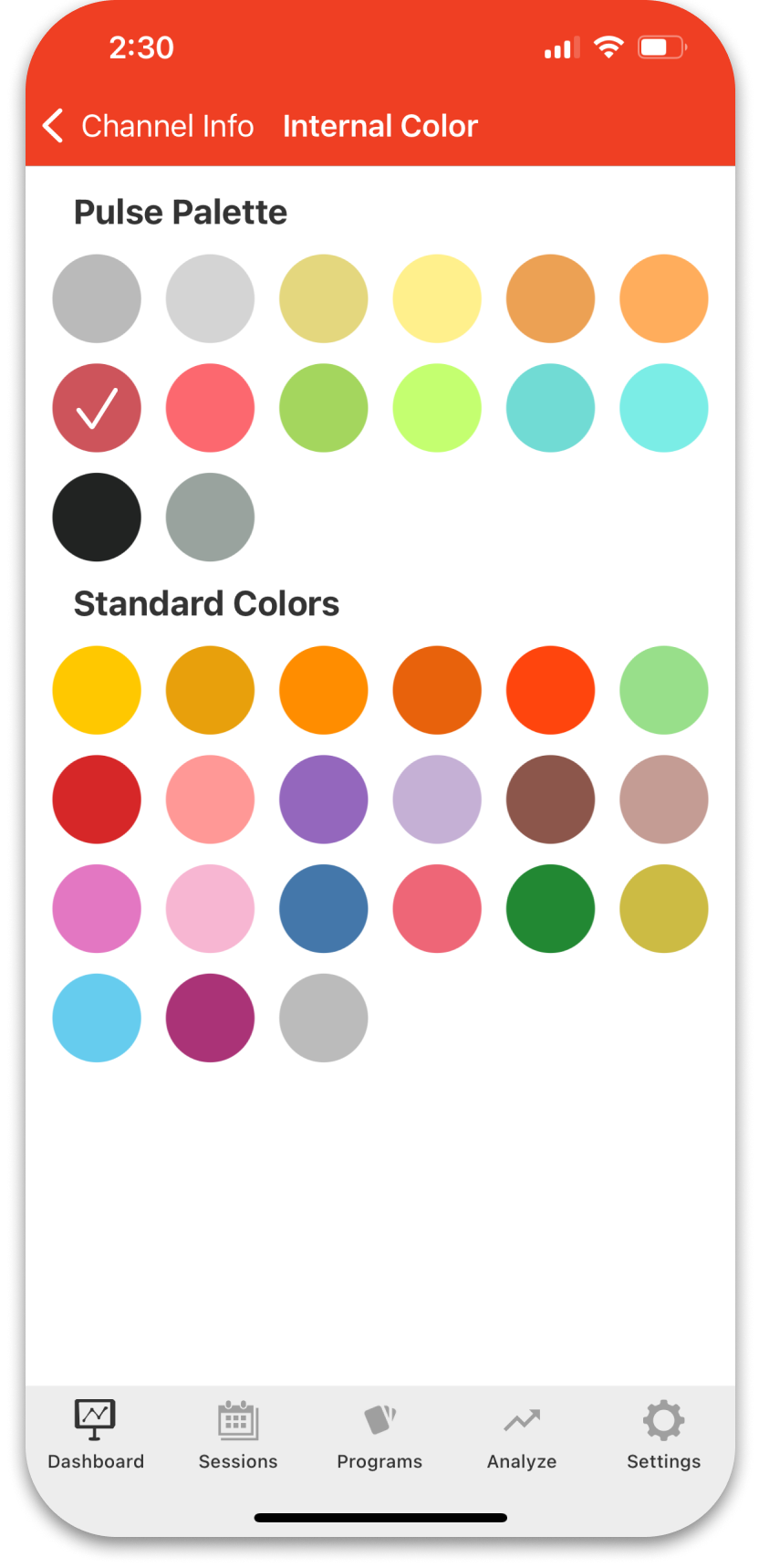
To change the channel color, tap the current channel color circle and select your preferred color from the available palette.
You can also set an alert and manage notifications on the Channel Info screen.
Tapping on the right side of the channel row, on the chart, shows the Channel Detail screen. The Calendar/Clock icon allows you to view different time ranges for the channel. The Pencil icon will take you to the Channel Info screen. You can tap the channel name/temperature on the left on this screen to reach the Channel Info options.
